
BACKGROUND
Cidon are a national contractor specialising in reinforced concrete works since 2000, with bases in England and Scotland. NX worked closely with Cidon's comms team to develop a logo, brand and values revamp which aligns with their groundbreaking, industry leader approach and reinforces their already stellar reputation.
The process we went through learning about Cidon's evolution and ethos was insightful and helped us to design an effective visual identity that looked forward whilst also retaining their core values
BACKGROUND
Cidon tracked us down after seeing our work for Lane End, rebranding them from the top-down and developing their new website, consulting on marketing strategy and collaborating with HashaTech on a bespoke app for their internal comms and workflow.
Cidon wanted to retain their 'family-feel' company dynamic whilst expanding into Scotland and Canada from their original Barnsley based head office. Expanding a business always comes with growing pains and can it be easy to lose that sense of family and belonging especially when it becomes diluted and spread out over a large area. This became our biggest but most interesting challenge.
BRANDING
It was important for Cidon that their staff were involved in every stage of the re-brand so we conducted interviews with staff members in both the head and regional offices. Our aim was to get an idea of Cidon's core values, ethos and how they wished to see the company evolve and grow with its new visual identity.
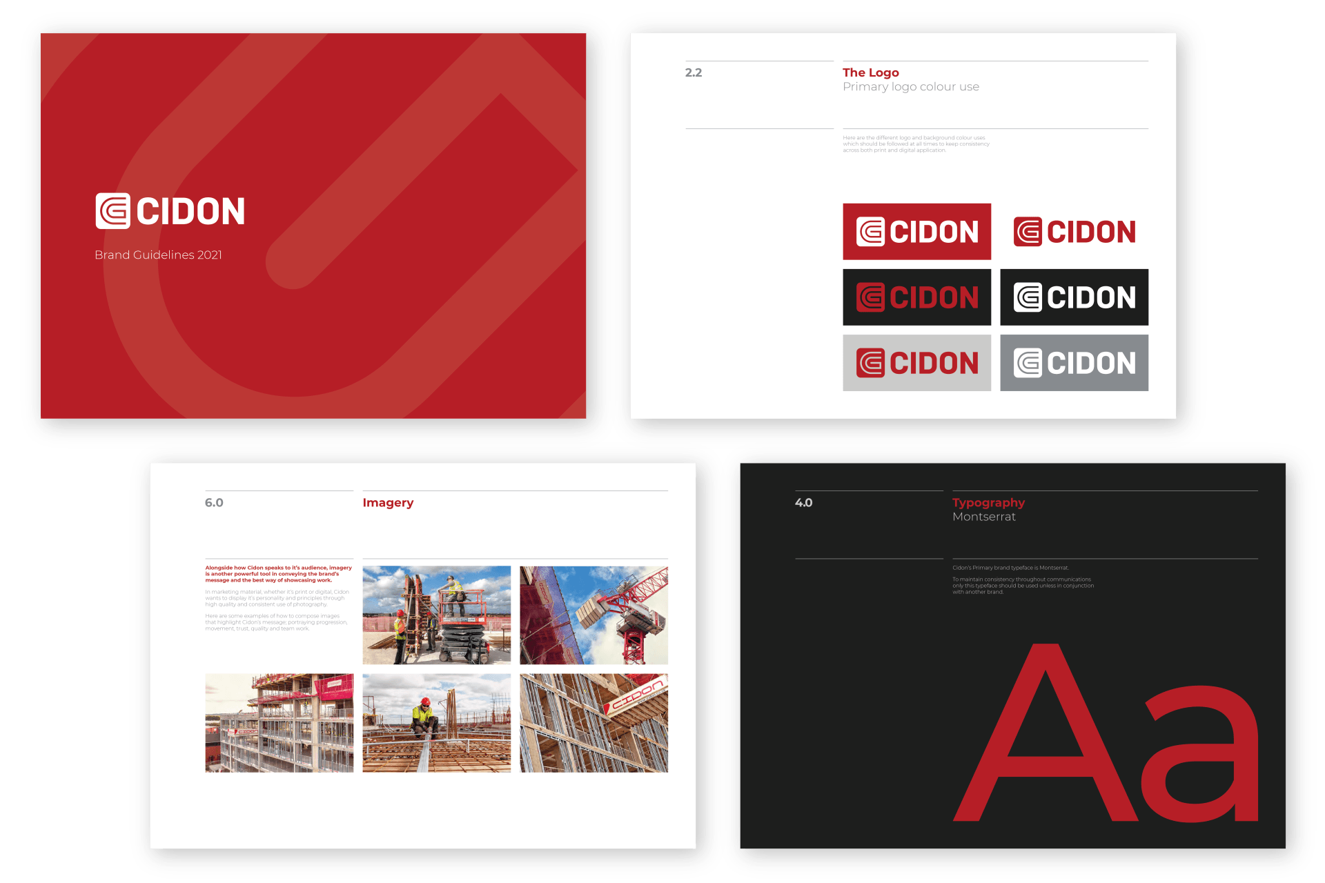
From the feedback from staff and consultation with management we developed 6 concepts and logos that we thought would modernise their visual identity whilst retaining what's most important to them; the happiness of their team.
Once the external branding had been decided we set about overhauling Cidon's internal identity. To improve communications and become more organised and efficient we re-branded and standardised all internal documents, from project case studies to newsletters and tender submissions.
Below are some examples of logo concepts we put forward to Cidon before settling on their favourite.
TONE OF VOICE
Alongside the revamp of Cidon's visual identity a lot of focus was put on to how they communicated verbally as well.
Without a brand guidelines that sets out the rules and style of how a company speaks to their audience, inconsistency can send the wrong message and effect marketing strategy. This was something Cidon wanted to get right both internally and externally. We brought in our trusted content writer to make sure the foundations were set in place for the launch of the rebrand.
Hannah got involved in our consultation and interview process with staff members from day one so she had as much information as the design team to develop a tone of voice guidelines that not only matched the new visual identity but reflected the core values of the team and their business goals going forward.
It was an absolute pleasure to work alongside Northern Exposure on this project. To get a well rounded and thorough understanding of the company, we interviewed key members of staff from each branch and got their take on Cidon's principles, personality, current image, community outreach programmes and more.
SUCCESS
Cidon Construction now has a strong and contemporary look and feel that matches the efficient and high quality service they provide in the construction sector. Whilst modernising their internal and external visual identity, we made sure Cidon maintained their core values and company ethos.
